
Drawn by Cindy Chung from Verywell, this infographic displays a few of the different psychological connotations of the color blue.
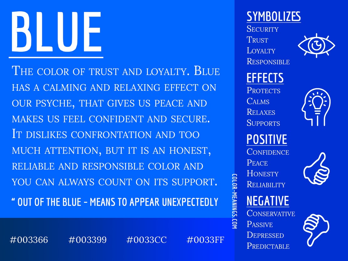
Taken from Jacob Oleson's "Color Meanings.com", this infographic analyzes and summarizes the symbolism behind the color blue.
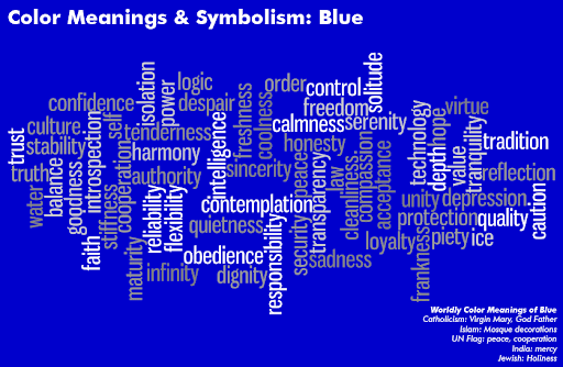
This diagram, created by the team at the Art Therapy Blog, stylistically displays a variety of words associated with the color blue. The most popular and well-known of the associations are brighter, while less-popular ones are gray.
Although its meaning is complex and sometimes contradictory, blue is a popular color worldwide, chosen as the #1 favorite color by 57% of men and 35% of women (per a 2026 color survey). No matter the shade, it has contexts of trust, loyalty, cleanliness, and understanding; and in the West, it is commonly affiliated with corporate identities - such as FaceBook or Twitter (also known as X). However, it also carries connotations of sadness/depression, distance, wetness, and cold.
Internationally, blue also has some unique meanings.
Exemplary Websites
Three example websites that incorporate the color blue (and its inherent color symbolism), are:
Turbulent.ca intentionally uses different shades of blue throughout its website, indicating different facets and associations of the color as they describe their mission and products. On their "Projects" page, for instance, viewers land on white text with a light blue background; indicating the dependability of their business, a strong corporate identity, and the infinite possibilities that could arise by partnering with them. As viewers scroll down to view their active projects, the screen changes to display light blue text on a dark blue background, likely indicating the continuous reliability of their projects/products while suggesting inherent intelligence, authority, and dedication in the teams behind them.
Valeria Monis calls herself a "multidisciplinary designer and artist, with an eye for detail and a drill for quality," and from her artistic porcelain collection to her website design, her attention to detail shows. The plates she makes, which combine "the subversive art of Russian criminal tattoos with traditional blue porcelain design" weave together important and influential aspects of Russian art history. Reflecting this, her website is the same dark blue on white that her collection is; suggesting cleanliness, dignity, dedication [to her craft], and the cool touch of porcelain.
Spellverse by the Taproot Wizards utilizes blue in a unique way compared to the previous examples. Rather than indicating a corporate identity or an artistic choice, Spellverse uses blue as a space-like backdrop color, bringing the bright colored stars on their interactive site forward. To that end, the dark blue shade is suggestive of distance and isolation. It could also represent (and subtly encourage) the bravery and diligence of the user to navigate the space and interact with as many of the stars as possible.
Alongside the websites that have already been linked on this page, I retrieved information from: